Cook books have a distinctive typography choice throughout all books published - serif typefaces. Titles of books consist of Georgia, Adobe Garamond Pro, Minion Pro, Palatino, Baskerville, and Goudy Old Style typefaces; these tend to be easier to read in printed books.
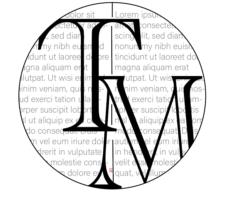
Cookbook Titles
On the covers of cook book recipe books, traditional typefaces which are used within the body are enlarged and bolded to be used as the masthead, this allows the book to have a consitent font theme throughout. The titles of cookbooks tend to be all capitalised or not at all; capitalised mastheads are used to attract readers whereas small text titles are more simplistic and suggest a more straightforward recipe book.
Typography Analysis 1808-1900
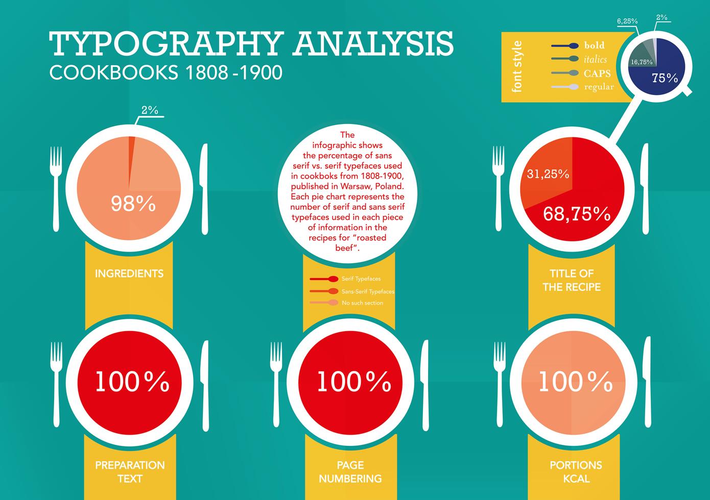
From the data presented above, the infographic highlights that between the years of 1808-1900 serif fonts are most popular in terms of typography choices regarding titles of recipes and the text within the book. With the addition of a 75% bold style, it demonstrates that the traditional and bold typefaces were popular within the time period.
Title of the Recipe:
From the statistics it is evident that over 68% of recipe titles within cookbooks from the 1800s were in a serif typeface, as assessed these could be of:
- Georgia
- Adobe Garamond Pro
- Minion Pro
- Palatino
- Baskerville
- Goudy Old Style
The recipe titles are usually the part of text that is aimed to be seen first therefore it is important that the bold style grabs the attention of the consumer. The use of the serif typefaces establishes the traditional theme of recipe books and follows typical conventions.
Preparation Text:
The infographic shows that the texts within the recipe books were 100% serif font used. Having no other differing fonts used within the bulk of the text highlights that it is following conventions and performing a sophisticated tone throughout.
Page Numbering:
Following consistent conventions, the page numbering within the 1800s cookbooks is also of a serif typeface, this conveys a traditional theme and keeps an accordant concept within all pages.
Typography Analysis 1901-2001
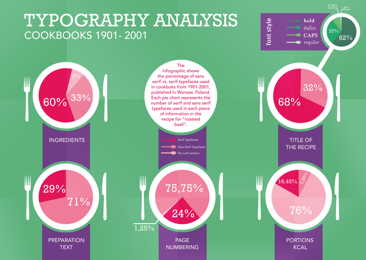
Constrastingly, the data gathered from a century later during the years 1901-2001 deplicts a change in typeface used, significantly in the preparation text as the bulk text within the books. It is also evident that the font style has differed demostrating a loss in use of bold style at only 62% compared to a previous 75% in the 1800s, which has been dominated by a higher use of italics at 27% from 16.75%.
Title of the Recipe:
Within the inforgraphic it displays practically the same percentages as the century before, which conveys that the heading of the recipe proves to be the same traditional font and is a consistent and popular choice within recipe books.
Preparation Text:
These statistics highlight the most change in comparison to the century prior by serif font dropping to only 29% use against the 100% in the 1800s. ‘Sans-serif’ font heavily takes over the text at 71% of the text within the cookbooks, suggesting a more modern and easily read stance. Using sans-serif as the bulk of the text inside the book contrasts against the title name giving the book some diversity and change. This is a given understanding that a change within years for typography of cookbooks has occured, emphasising a development in typographic font within print.
Page Numbering:
The page numbering of the cookbooks within the years 1901-2001 differs significantly from the year prior as it shows more than 75% was sans-serif typeface against the 100% serif fonts the century before. This implies development in the typefaces used within print, similarly to the preparation text as it shows the consistency througout the pages.
Overview
In conclusion, the comparison between the years of 1800 and the 1900 cookbooks typography highlights that their has been change in the choices of typefaces used within print media. The more traditional serif font and bold style was used on the older cookbooks with a lack of variation between the two sans-serif and serif typefaces. Whereas the cookbooks within the 20th century had developed in terms of typography choices which were shifted to a more modern look of sans-serif, especially in the bulk of the text within the books. The style of italics also became more popular as the bold dropped.
Source analysis: https://www.behance.net/gallery/10862893/Master-thesis-cookbooks-analysis
Source analysis: http://www.selfpublishacookbook.com/info/how-to-design-cookbook/more/what-fonts-to-use-in-your-cookbook